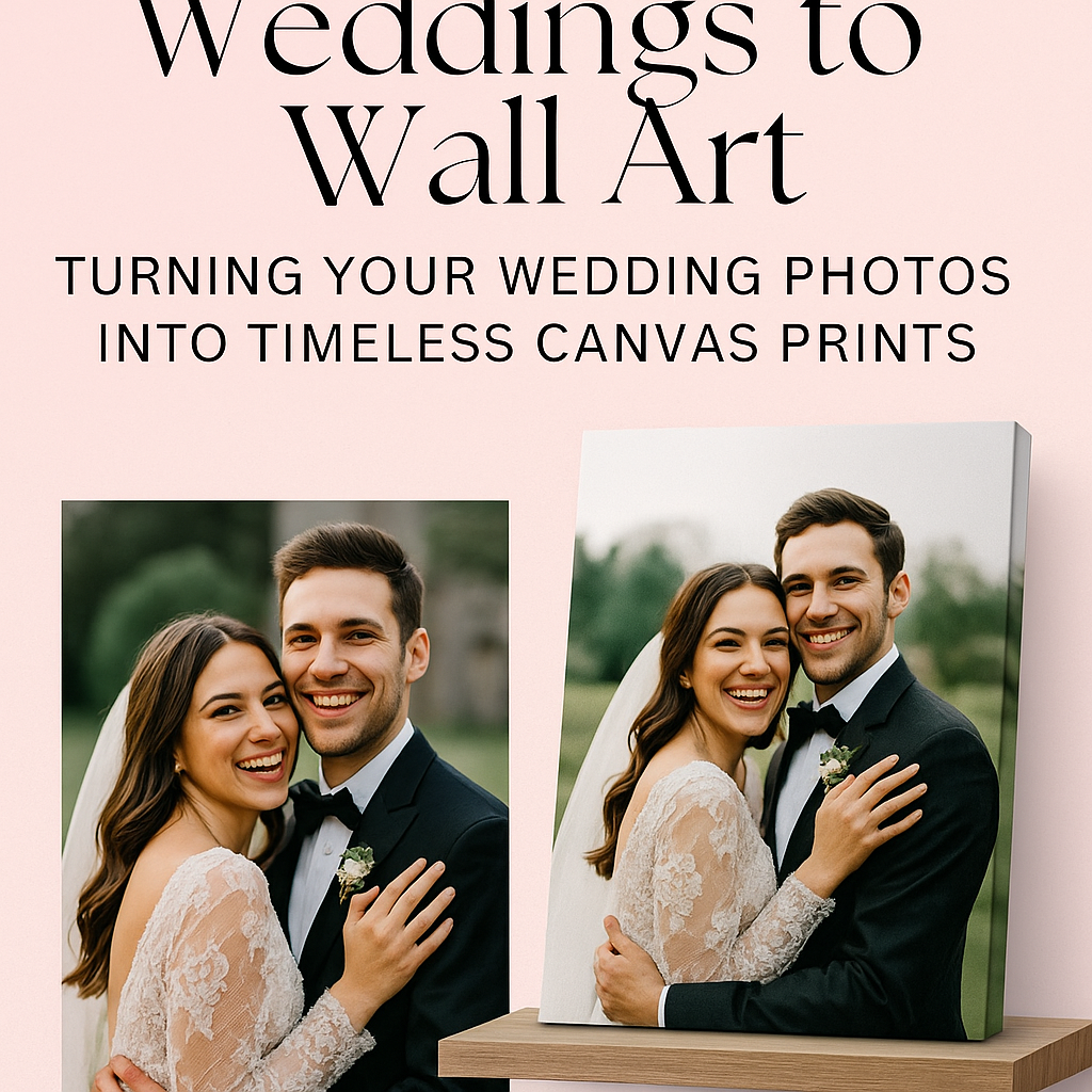
Weddings to Photo Wall Art: Turning Your Wedding Photos into Timeless Canvas Prints
From album to art—why it matters
Your wedding photos deserve more than a hard drive. Displayed on canvas, they become daily reminders of your vows, your people, and your shared joy. The goal is simple: curate a handful of images that capture the soul of your day and present them with clarity and intention.
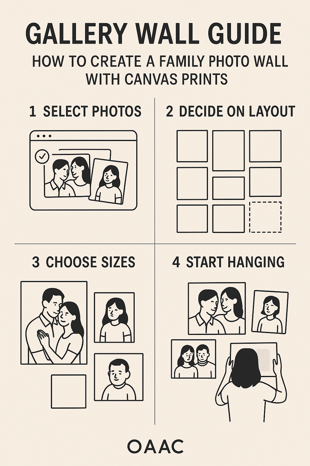
Step 1: Curate with a storyline
Think in chapters, not favourites. Build a sequence like:
- Quiet moments: Getting ready, letter exchange.
- Ceremony: A wide angle of the aisle and a close‑up of ring exchange.
- Portraits: The two of you, then with family.
- Celebration: First dance, candid laughter, sparkler exit.
Selecting across the day creates a richer wall than five nearly identical portraits.
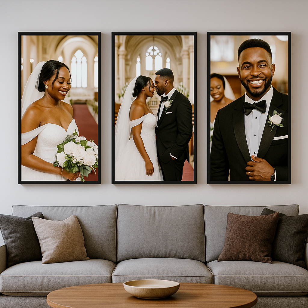
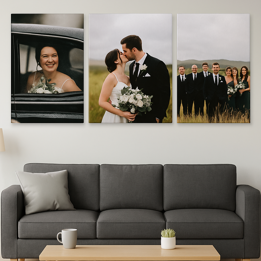
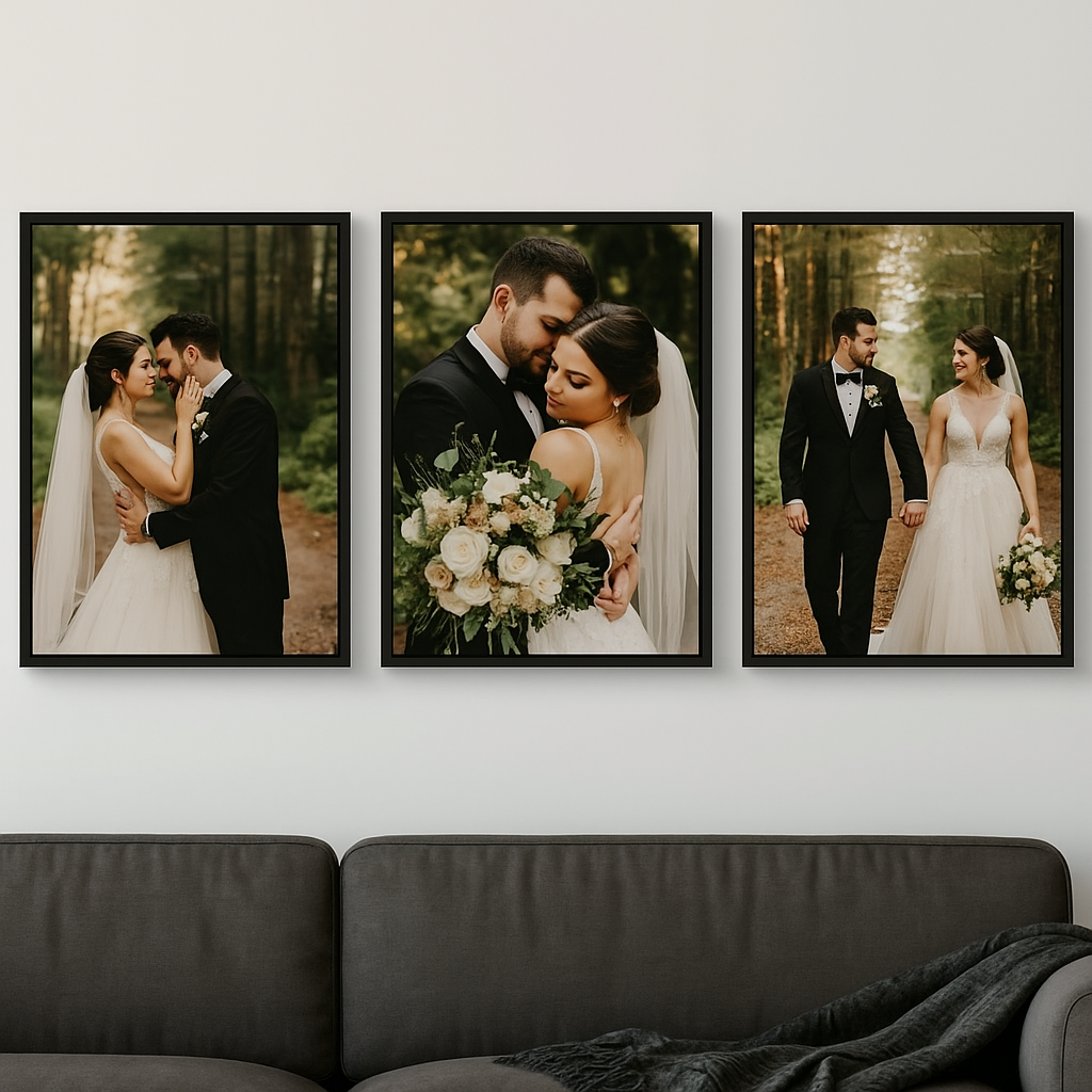
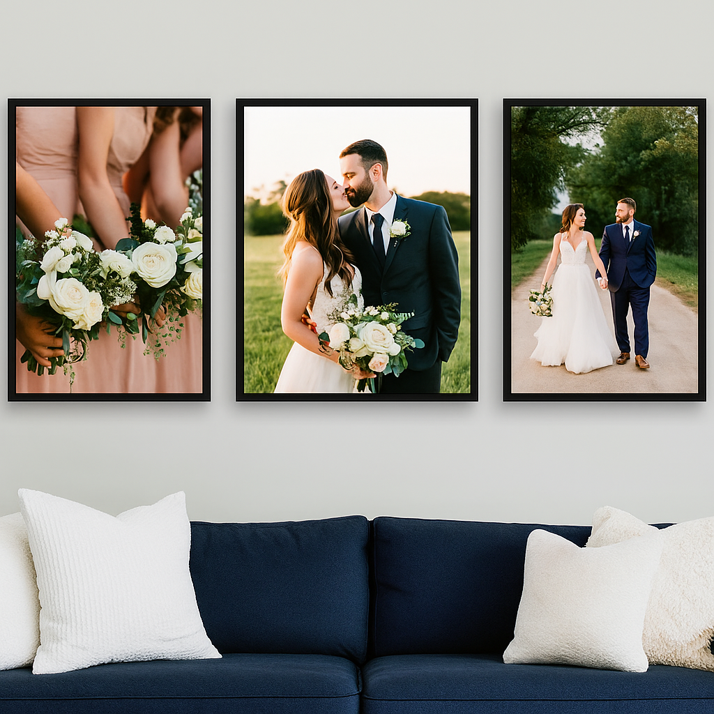
Step 2: Choose formats that match the images
- The hero piece: One 30″×40″ anchor above the sofa or bed—typically a joyful portrait or a cinematic ceremony shot.
- The triptych: A wide landscape split into three 16″×24″ panels; great for mountaintop or lakeside weddings.
- The story grid: Six or nine 12″×12″ canvases mixing candid and detail shots (bouquet, cufflinks, invitations).
Design rule: Keep either subject or colour consistent. If your outfits repeat across images, you can vary tones; if tones vary, keep subjects consistent.
Step 3: Edit for print, not just screens
- Brightness: Lift midtones slightly — canvas prints often read darker than backlit screens.
- Contrast: Moderate; too much crushes shadow detail.
- Skin tones: Warm, natural tones age better than trendy desaturation.
- Black‑and‑white: Use sparingly for drama (first look, vows) and mix with colour for sophistication.
Step 4: Mind your background
Busy hotel carpets and “exit signs” can distract. If your photographer provides clean backgrounds, choose those. Otherwise, crop generously or convert to black‑and‑white to minimize clutter. Negative space makes type overlays (dates, vows) easier to read.
Step 5: Typography that whispers, not shouts
If adding text—names, date, a short vow—keep it small and refined. Serif fonts feel classic; simple sans‑serifs feel modern. Place text in corners or along edges to preserve the photo’s emotion. Less is more.
Step 6: Placement and scale in real rooms
- Living room: A hero canvas above the sofa at ~⅔ sofa width; if ceiling height is low, go wider rather than taller.
- Bedroom: Softer, intimate images above the headboard; avoid overly busy reception shots here.
- Hallway: The story grid works well for narrow spaces and invites closer viewing.
Step 7: Frames & finishing touches
Canvas prints don’t need glass, which keeps things lightweight. For a gallery look, add a floating frame in black, walnut, or white oak; match to your furniture finishes rather than your wall colour.
Step 8: Print quality & resolution
Ask yourself: can you zoom to 100% and still see clean edges around eyelashes and lace? If yes, you’re good. For files below ideal resolution, choose smaller sizes, images with less fine detail, or embrace black‑and‑white for a classic, forgiving finish.
Inspiration sets to copy
- The vow wall: Left panel—one line from each vow in elegant type; centre—your favourite kiss; right—hands with rings.
- The landscape love story: Three frames of your ceremony vista at different times (pre‑ceremony calm, golden hour, twinkle‑light night).
- The people who made it: Parents, wedding party, grandparents—candid laughter over posed smiles.
Care & longevity
Dust with a dry microfiber cloth. Keep out of direct, harsh sunlight when possible. If you move, save the corner protectors from your shipment and slide them back on for safe transport.
Ready to make it real?
Upload your selects to CanvasPrintCanada.com, preview triptychs and grids, and choose floating frames for the rooms that need polish. Your wedding day was crafted with intention—your walls should be, too.